


Bugera Lamb Fine Art
Branding
Background
Bugera Lamb Fine Art, formerly known as Bugera Matheson Gallery, has been a part of Edmonton’s art community for decades, evolving through different names and locations while remaining committed to showcasing and supporting fine art. Under new ownership, the gallery sought to refresh its brand identity to reflect its values better, attract a wider audience, and enhance the experience of discovering and collecting art.
Problem
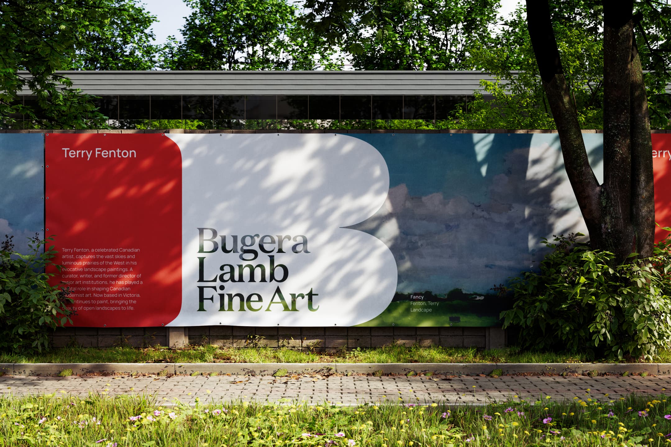
With the name change came the challenge of reintroducing the gallery to its audience while ensuring brand recognition and continuity. The previous branding lacked a distinct visual identity, making it harder to stand out in Edmonton’s Gallery Walk. Additionally, the gallery’s unique basement location, while an integral part of its charm, needed to be reframed as a compelling feature rather than a limitation. The brand needed a refreshed identity that captured the gallery’s character: a place of curiosity, discovery, and joy.
Approach
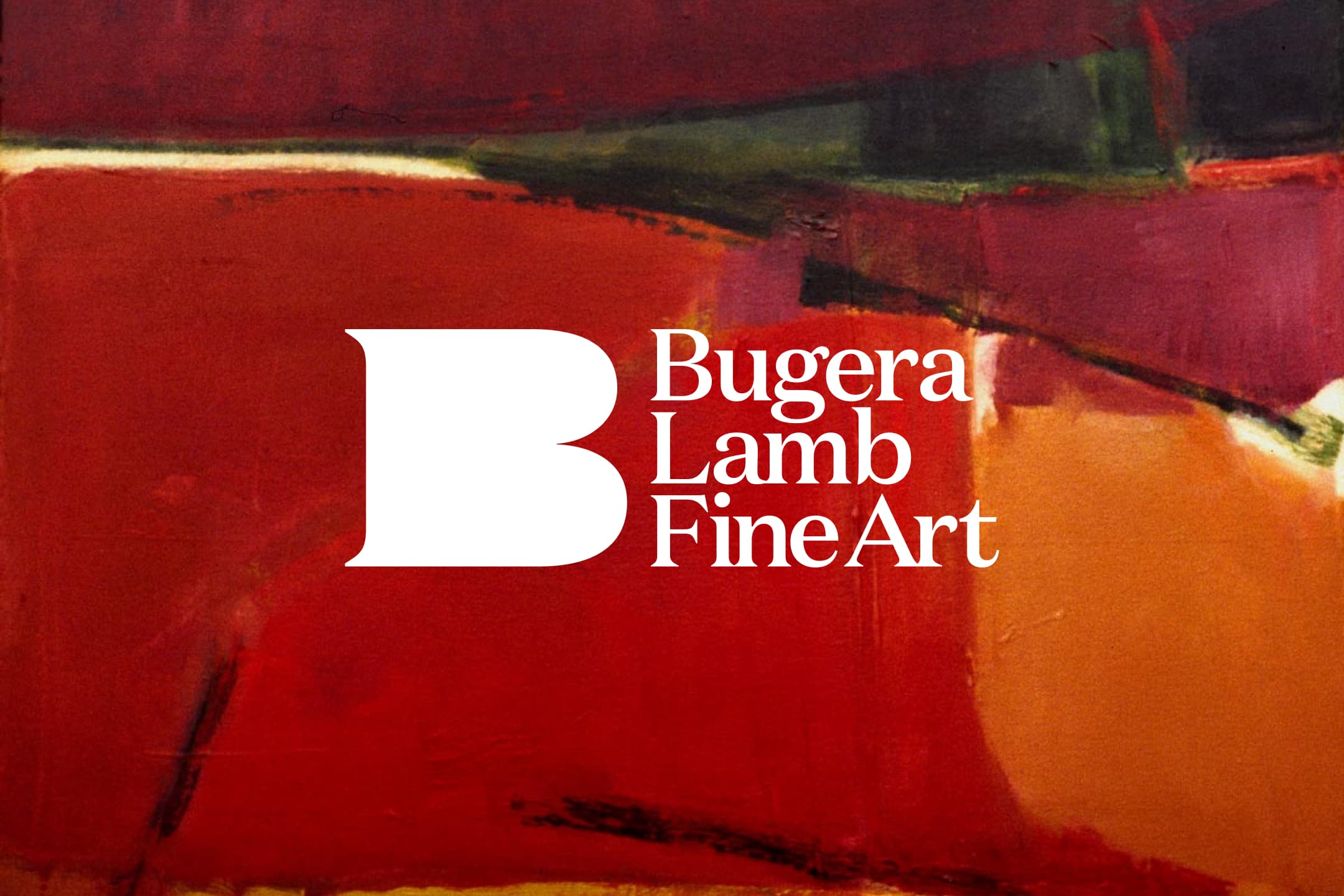
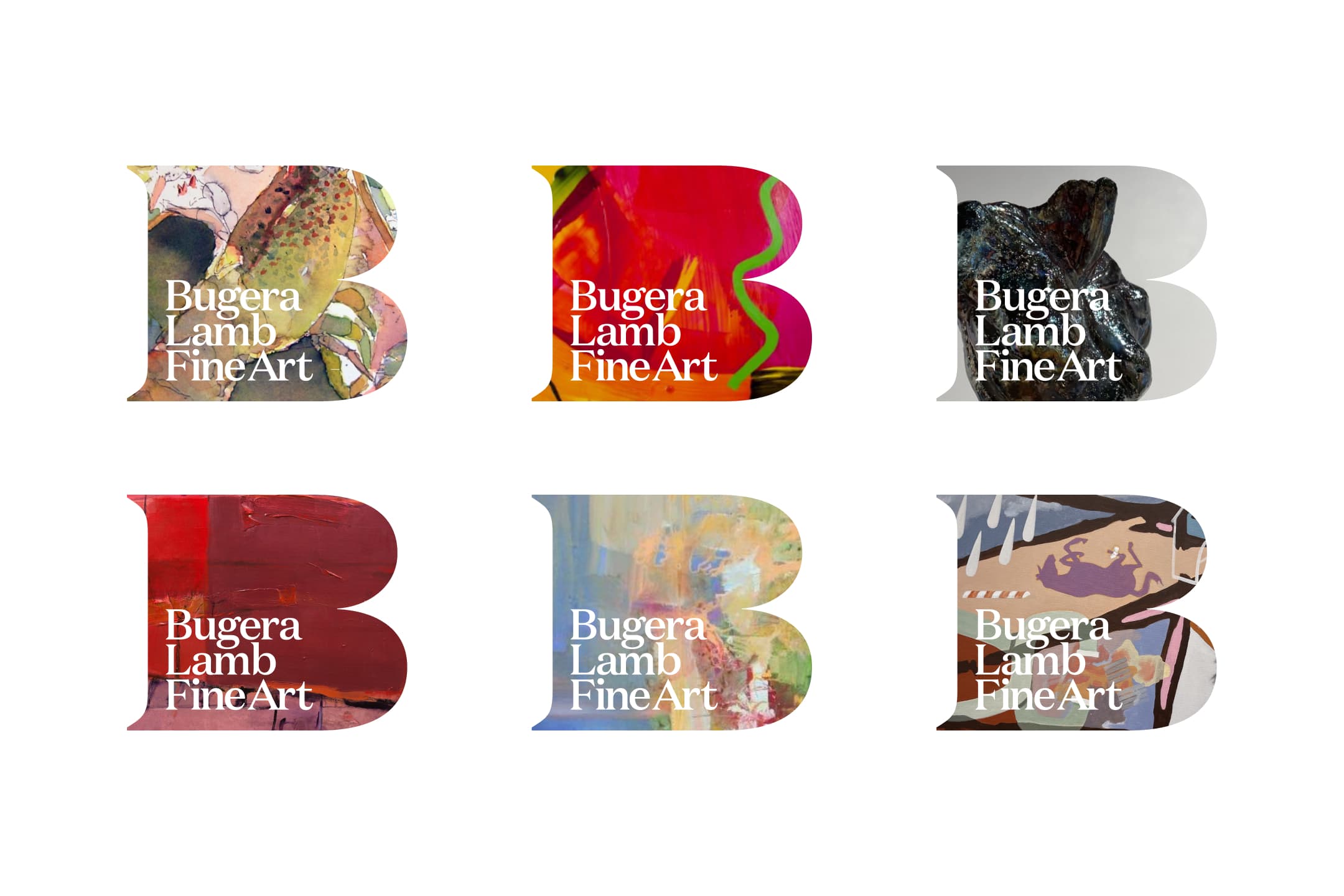
The rebranding focused on creating a mark that was both distinct and functional. The new identity introduces a bold yet refined "B" that acts as a recognizable symbol and a visual frame—echoing the act of viewing, selecting art, looking up close, and finding a hidden gem. The colour palette was adjusted to a deeper, more balanced red, setting the gallery apart from competitors while remaining inviting and elegant. Typography was chosen for its accessibility and sophistication, ensuring team ease of use.
The brand system allows for flexibility, from signage to digital applications, and integrates the concept of discovery through masked artwork within the "B." The result is a refreshed identity that reflects the gallery’s expertise, passion, and the joy of finding art that resonates.
Year
2025
Role
Brand Designer
Designed at
Overhaul
Credits
Mathew Janzen, Creative Direction
Faaiza Ramji, Marketing & Messaging


Bugera Lamb Fine Art
Branding
Bugera Lamb Fine Art
Branding
Background
Bugera Lamb Fine Art, formerly known as Bugera Matheson Gallery, has been a part of Edmonton’s art community for decades, evolving through different names and locations while remaining committed to showcasing and supporting fine art. Under new ownership, the gallery sought to refresh its brand identity to reflect its values better, attract a wider audience, and enhance the experience of discovering and collecting art.
Problem
With the name change came the challenge of reintroducing the gallery to its audience while ensuring brand recognition and continuity. The previous branding lacked a distinct visual identity, making it harder to stand out in Edmonton’s Gallery Walk. Additionally, the gallery’s unique basement location, while an integral part of its charm, needed to be reframed as a compelling feature rather than a limitation. The brand needed a refreshed identity that captured the gallery’s character: a place of curiosity, discovery, and joy.
Approach
The rebranding focused on creating a mark that was both distinct and functional. The new identity introduces a bold yet refined "B" that acts as a recognizable symbol and a visual frame—echoing the act of viewing, selecting art, looking up close, and finding a hidden gem. The colour palette was adjusted to a deeper, more balanced red, setting the gallery apart from competitors while remaining inviting and elegant. Typography was chosen for its accessibility and sophistication, ensuring team ease of use.
The brand system allows for flexibility, from signage to digital applications, and integrates the concept of discovery through masked artwork within the "B." The result is a refreshed identity that reflects the gallery’s expertise, passion, and the joy of finding art that resonates.
Year
2025
Role
Brand Designer
Designed at
Overhaul
Credits
Mathew Janzen, Creative Direction
Faaiza Ramji, Marketing & Messaging
Bugera Lamb Fine Art
Branding
3:39:52
Bugera Lamb Fine Art
Branding